 |
Drawing Perfect (Correct) Parabolas |
 |
Drawing Perfect (Correct) Parabolas |
I have seen many miserable, horrible attempts to draw an approximation to a parabola in other instructors' handouts, tests, and quizzes. The freely available drawing utilities like MS Paint, and the drawing utility within MS Word, cannot create an accurate parabola.
|
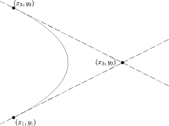
The command for the bézier curve in LaTeX is The curve begins at the point (x1, y1) and ends at the point (x3, y3). The point (x2, y2) is the control point. The curve is drawn so that it is tangent to the line through (x1, y1) and (x2, y2) at (x1, y1), and tangent to the line through (x2, y2) and (x3, y3) at (x3, y3). |
 |
|
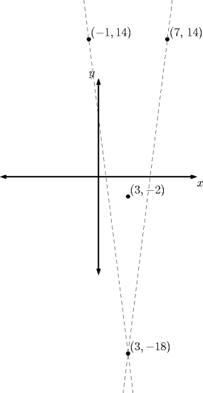
Planning We begin by finding the axis of symmetry. The control point will lie on the axis of symmetry. We can also find the location of the vertex: Now, choose two points for the start and end of the parabola. I am choosing points 4 units to the left and right of the axis of symmetry, (-1, 14) and (7, 14). Of course, this will vary for each graph you want to create. Using a little calculus, find the equation of the tangent line at the point (-1, 14). 
|
|
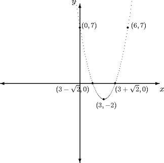
\setlength{\unitlength}{.8 mm}
\begin{picture}(100,100)

%Draw the x- and y-axes and label them
\thicklines
\put(50,50){\vector(0,1){50}}
\put(50,50){\vector(1,0){50}}
\put(50,50){\vector(0,-1){50}}
\put(50,50){\vector(-1,0){50}}
\put(100,45){$x$}
\put(45,100){$y$}

%Draw the parabola and label some points
\qbezier(45,120)(65,-40)(85,120)

% y-intercept
\put(50,85){\circle*{1.5}}
\put(51,85){\footnotesize $(0,7)$}

% Another point using symmetry
\put(80,85){\circle*{1.5}}
\put(82,85){\footnotesize $(6,7)$}

% x-intercepts
\put(72.071,50){\circle*{1.5}}
\put(72,45){\footnotesize $(3+\sqrt{2},0)$}

\put(57.9289, 50){\circle*{1.5}}
\put(35,45){\footnotesize $(3-\sqrt{2},0)$}

$ Vertex
\put(65,40){\circle*{1.5}}
\put(60,35){\footnotesize $(3,-2)$}

\end{picture}
|
|
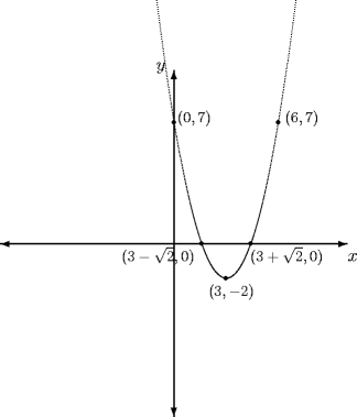
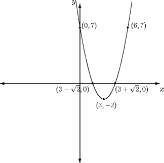
First, the graph doesn't need to be so tall. Instead of starting at (−1, 14) and ending at (7, 14), perhaps we could start at (−0.5, 10.25) and end at (6.5, 10.25). Repeating the work from above, we find that the control point is now (3, −14.25).
Second, notice how the parabola "tapers" at the ends? The
\qbezier command takes an optional argument "num"
\qbezier[num](x1, y1)(x2, y2)(x3, y3)num is the number of samples taken to draw the curve—it is actually drawn as a series of dots, equally sampled between x1 and x3. When y has a relatively low rate of change with respect to x, as it does in the neighborhood of the vertex, we get a smooth curve. When y varies relatively rapidly, we begin to see the individual dots that make up the curve. How do we fix it? We partly take care of the problem by using a shorter curve. We can also increase the sampling rate. In the code above, we change the line for the bézier curve to \qbezier[1000](47.5,101.25)(65,-21.25)(82.5,101.25)to produce the graph at the right. |
|
 |
 |
| num = 100 | num = default value |